Let’s work together!
I’m currently open to new opportunities, whether freelance, contract, or full-time. If you think I’d be a good fit for your team or project, I’d love to hear from you.
A homeowner-facing extension of Easy PV, helping people request and compare solar quotes without the confusion that plagued every other tool in the space at the time
Easy PV is a solar design platform installers use to size and price systems. The marketplace extended that same engine to homeowners, letting them request quotes directly while tapping into Easy PV's existing installer base.
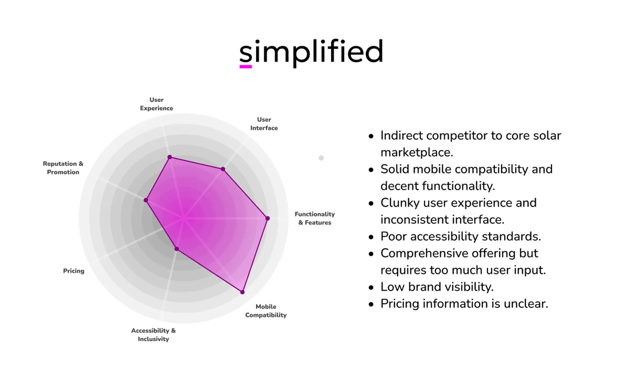
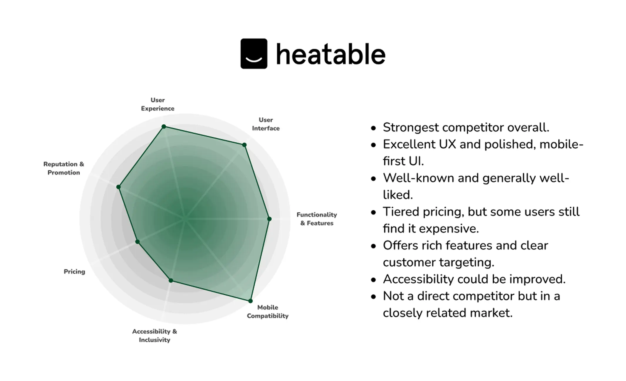
At the time, the direct competitor in solar quote comparison had poor visibility and a clunky interface. Indirect competitors like Heatable were far more refined and mobile-first. The goal was to match that simplicity while still surfacing multiple quotes at once, within a fixed constraint: build on Easy PV's existing technical foundation rather than starting from scratch.
Competitor analysis mapped the landscape: the direct competitor had similar functionality but lacked polish and reach, while Heatable succeeded through fewer steps and strong mobile usability. Key takeaways: minimise steps and jargon, prioritise mobile UX, and give users visible progress and a sense of trust throughout.
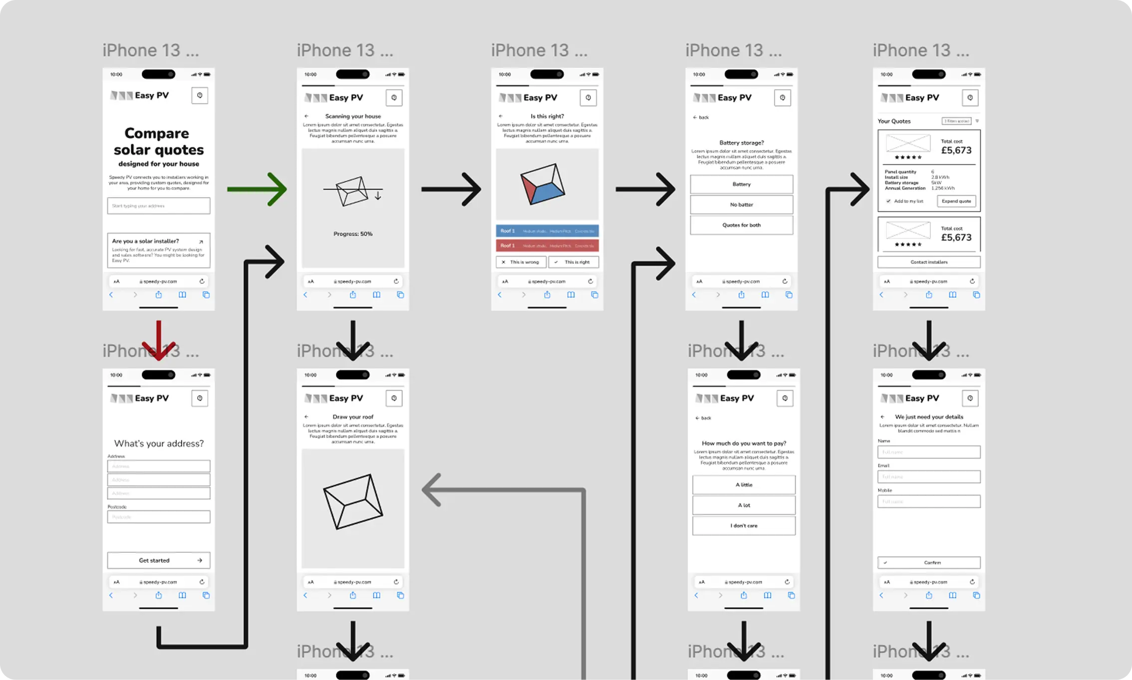
Mapped the full quoting flow: property lookup and auto roof-scan, manual fallback if scanning failed, preference setting, and final quote request.

Built a full interactive prototype in Figma and ran usability testing with internal team members and a small group of target users.
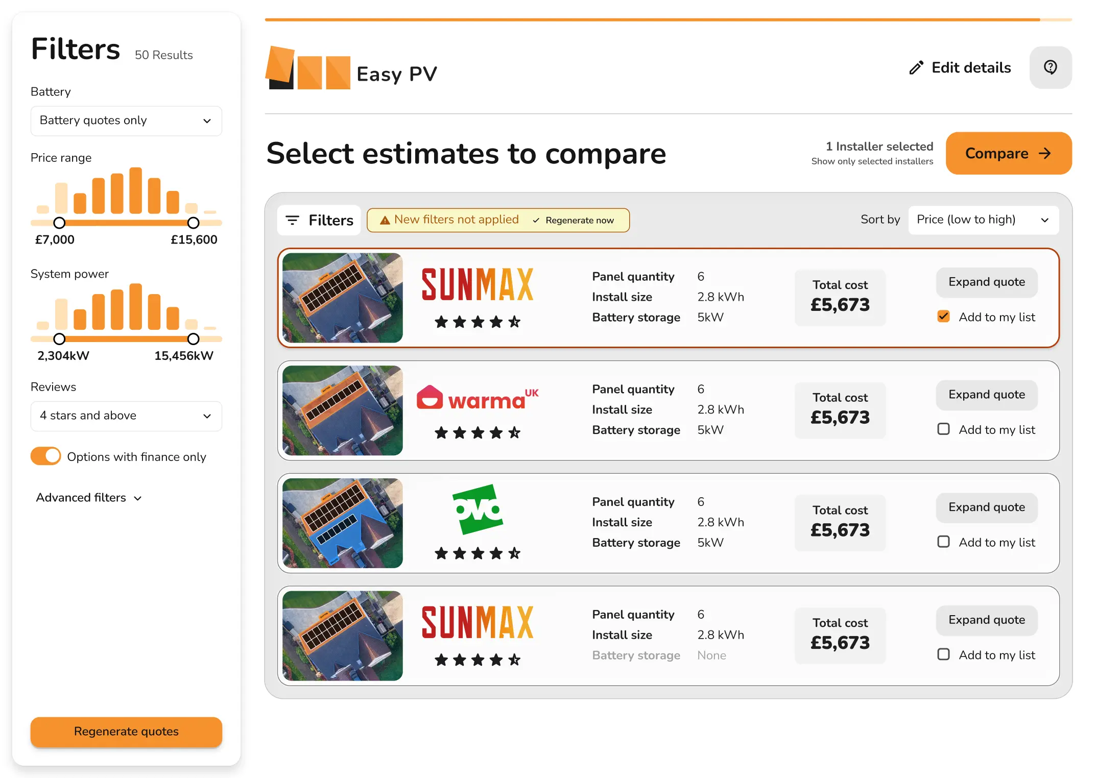
Delivered full specs and developer annotations, then iterated with engineering through build and initial QA. Final QA and launch were still in progress when I left.
Not yet measurable in production, since the product is still in development, but usability testing already gave a clear early read. Users followed the quote journey without confusion on their first attempt. Two issues did surface: roof drawing needed refinement on smaller screens, and some language needed simplifying to cut technical jargon, both were addressed directly in the next iteration.
This project combined technical accuracy with user-first simplicity, designing for trust, ease, and cross-platform use in equal measure. If I revisited it, I'd add A/B testing on the early steps to sharpen conversion, and explore profiling to simplify the form further.